Best Practices Novice Novice tutorials require no prior knowledge of any specific web programming language.
Here are some tips, tricks, and best practices to keep in mind when you create your (responsive) website using the built in options:
- Always use columns in the page structure
- Use auto heights on sections and columns
- Don't create spacings using line-height
- Don't create text aligns using the < br > HTML tag
- Remove empty columns from smartphones
- Change the columns width on tablets when possible
- Create smart spaces on tablets and smartphones
1. Always use columns in the page structure
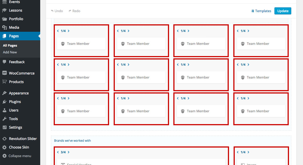
Make a habit to always use columns when you create your page structure. All the shortcodes work outside of columns as well but because columns have important responsive options it's good to maximize your control by using columns every time you want to add something to your page.
The responsive options from columns let you individually overwrite: the width of the column (on tablets portrait orientation) and the spacing of the columns (on tablets and smartphones).
2. Use auto heights on sections and columns
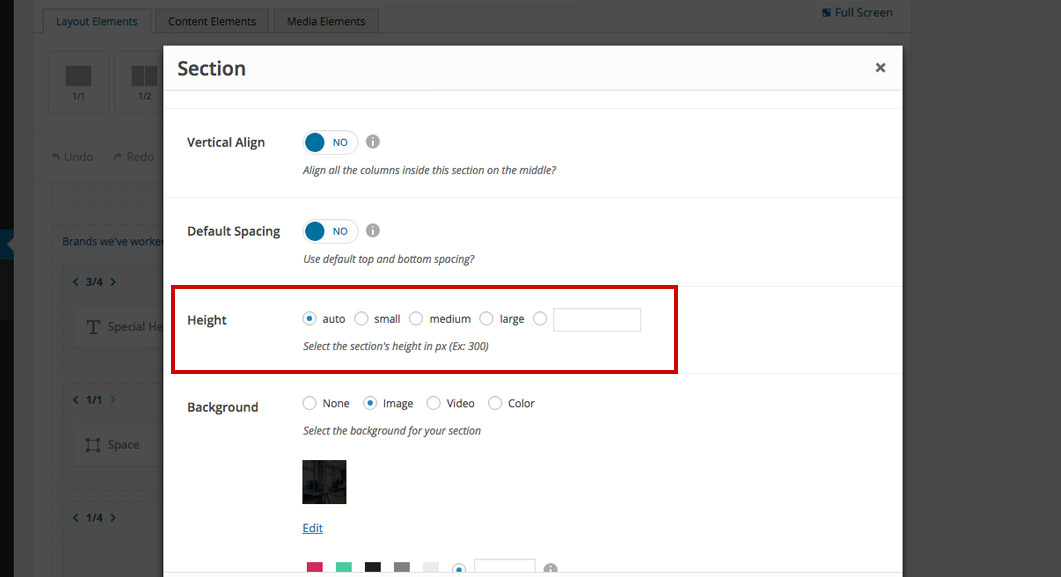
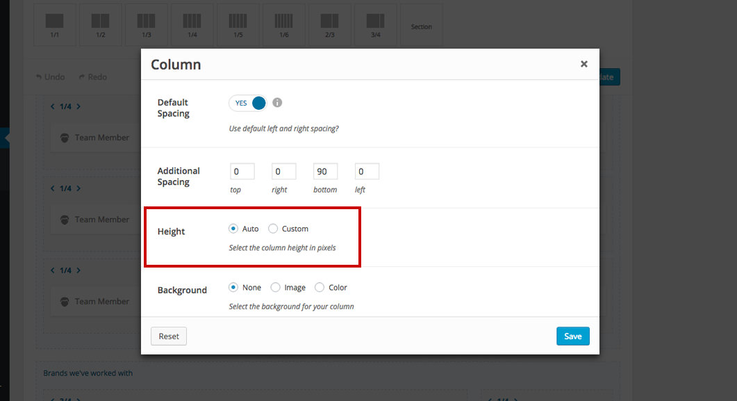
Try to always use the default Auto height option on sections and columns. Creating a fixed height for a section or column might create problems on responsive devices. If the content's height is larger then the section's or column's height, then part or the content will not be displayed. Use a fixed height for your sections or columns only when you specifically want to hide part of the content or want to create a particular structure for your page. Note that on smartphones (both landscape and portrait) we've automatically set the height for sections and columns to auto.
Set the height on Auto and use Space Shortcodes on top and bottom in order to create the height you want for your section or column. This way you can use the Responsive Behavior options from the shortcode in order to turn the spacings off on tablets and smartphones. Learn how to do it from this article.
Set the height on Auto and use the top and bottom Additional Spacing option from the column in order to create the height you want. This way you can use the Responsive Behavior options from the column in order to overwrite the additional spacings on tablets and smartphones. Learn how to do it from this article.
3. Don't create spacings using line-height
There are shortcodes or cases where you'll have a title and subtitle to set or a title and body text. Don't create spacings between them using the line-height options from the fonts. This might be a good solution if you were designing your website for desktop resolutions only but when you start decreasing the resolution (tablets & smartphones), the titles, subtitles and body texts start occupying more then one row and you'll get something like this:
Back-end
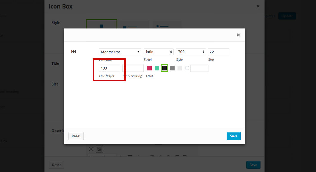
Desktop
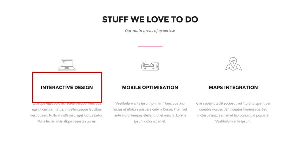
Tablet (portrait orientation)
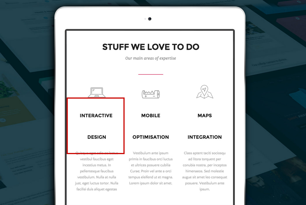
4. Don't create text aligns using the < br > HTML tag
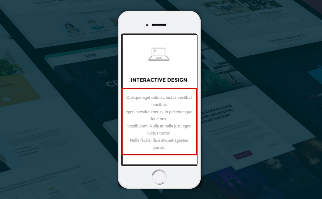
Always be aware that you are actually building a website that needs to have the content accessible on multiple resolution devices at once. With that in mind don't use the < br > HTML tag to create alignments for texts. Other wise you might get something like this on lower resolution devices (tablets & smartphones):
Back-end
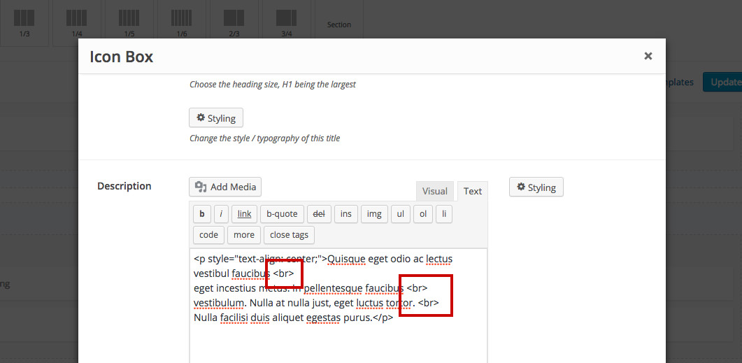
Desktop
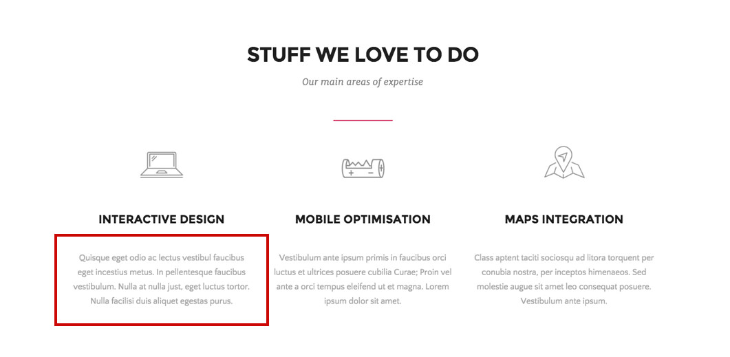
Phone (portrait orientation)
5. Remove empty columns from smartphones
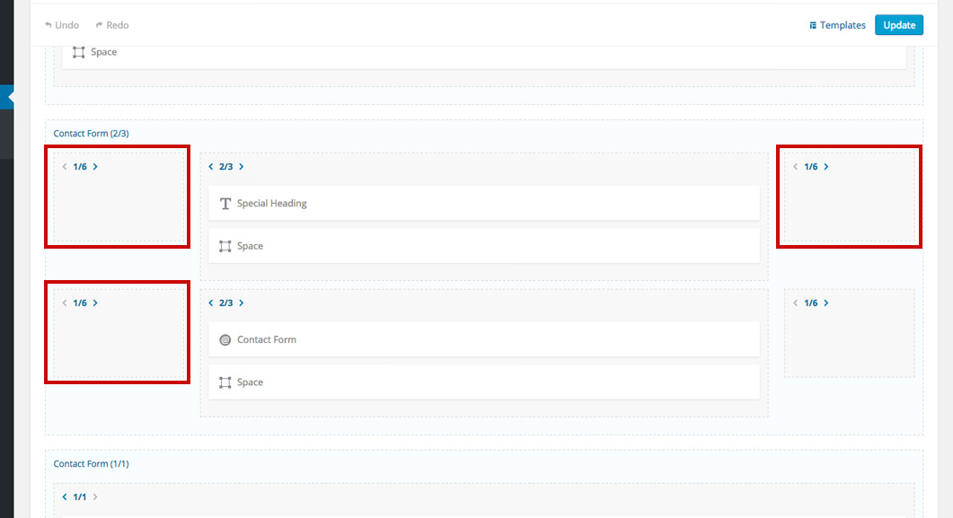
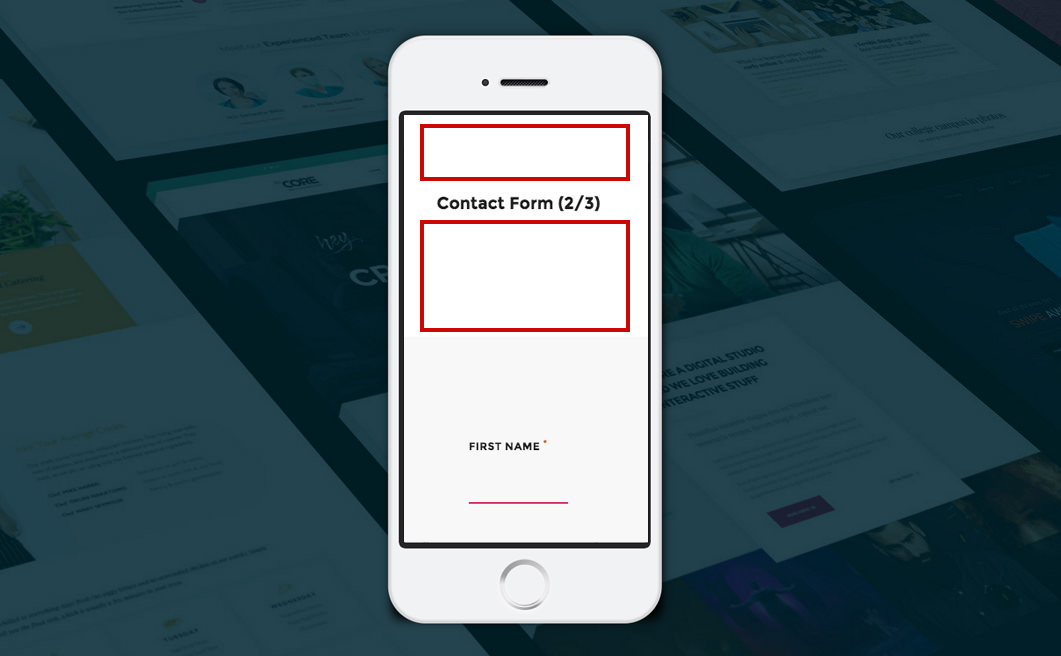
On smartphones, all columns will come with a default spacing of 20px top and bottom. Also, all columns are 1/1 by default so every empty column in your structure will add a 40px space because of the default spacings.
Back-end
Phone (portrait orientation)
Learn how to turn off columns on your smartphone from this article.
6. Change the columns width on tablets when possible
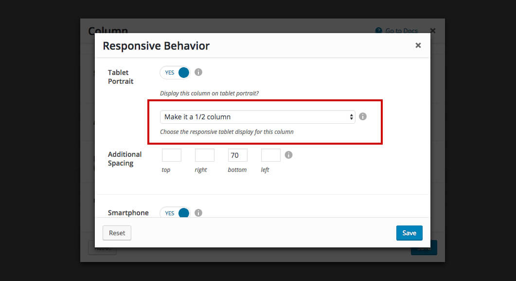
Every column can be forced to another width on tablet (portrait orientation). Use this option whenever possible to deliver a truly responsive experience to your users.
Back-end
Desktop
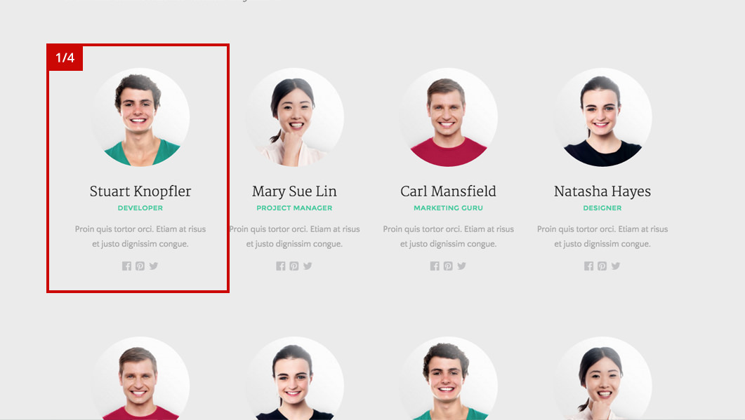
Tablet (portrait orientation)
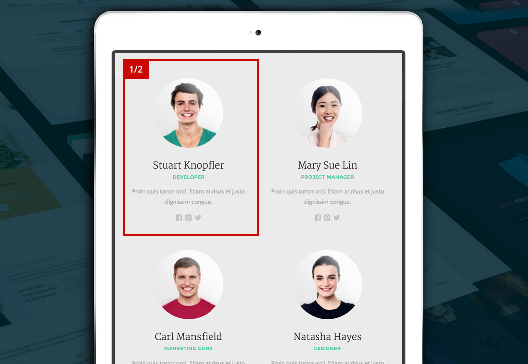
Learn how to change the width of your columns on tablets from this article.
Using the example above, an odd number of columns on a row can't be made in an even number on tablets because of how the HTML is built.
7. Create smart spaces on tablets and smartphones
Sometimes you'll want some space on your responsive website (tablet portrait and smartphone) but not that large as in the desktop (and tablet landscape) versions. Lets say you have a Space Shortcode of 300px. What you can do is split the shortcode in two space shortcodes (150px each), and turn one off on the device you need. This will allow you to have 2 x 150px (300px) on desktop and only 150px on tablet portrait for example.
Back-end (before)
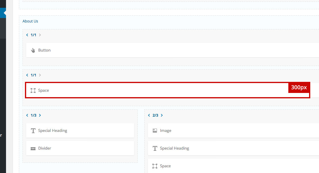
Back-end (after)
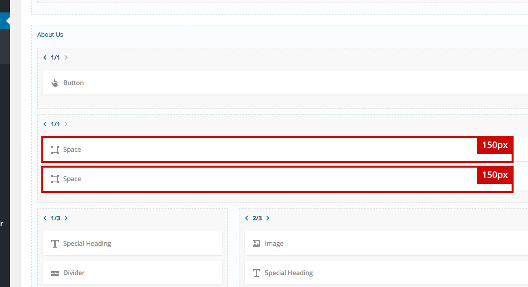
Learn how to turn off shortcodes using the Responsive Behavior option from this article.
