Button Novice Novice tutorials require no prior knowledge of any specific web programming language.
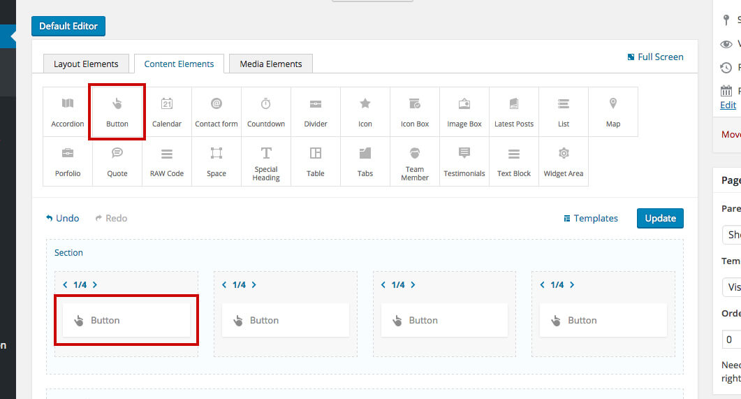
This shortcode lets you add a button to your page by dragging & dropping, or clicking on it:
Back-end

Front-end

The button options
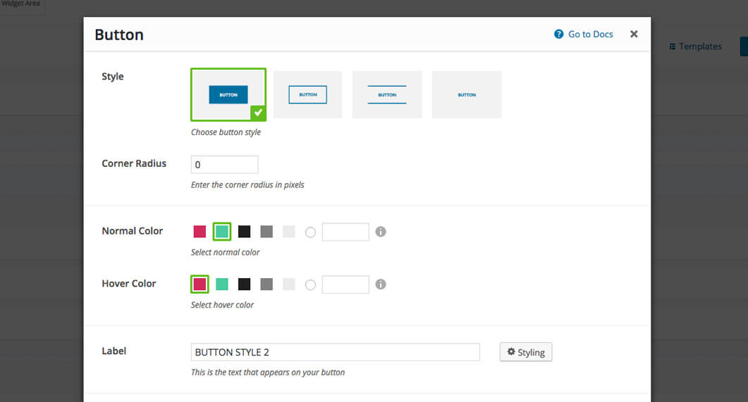
Click on the shortcode to bring up the options:

- Style - lets you select the button style. We've built in three choices of buttons.
- Corner Radius - lets you adjust the corner radius of the button.
- Normal & Hover Color - lets you select the color of the button background as well as its color while hovered
- Label - this is the text that appears on your button.
- Link - a URL link that your button will link to. Select YES in the next option if you want your link to open in a new window. If your link points to an image or Vimeo / YouTube video you can choose to open them in a pop-up by enabling the Open in Pop-up option.
Keep in mind
The Open in pop-up option will overwrite the Open in new window setting and will work only for images and Vimeo / YouTube videos.
- Button Size - choose from the three built in sizes or type in your own custom button size value for both width and height. Select YES in the next option to make the button full width. The full-width button will be calculated based on the container where the button is. If for e.g. you have the button in a 1/2 column, then the button's full width will be 1/2 of the page.
- Alignment - you can select the button alignment in the container.
- Icon - use this option if you want to add an icon to your button. You may also choose the icon position and its size
- Animation - enables you to create an animation entrance or exit for this shortcode. Demo previews for the animations can be found here.
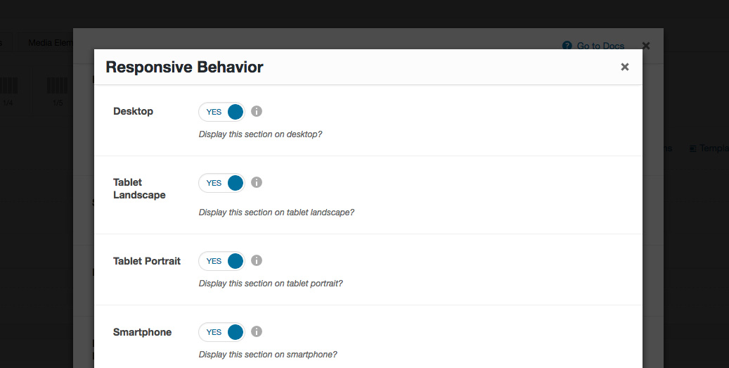
- Responsive Behavior - lets you control how this shortcode behaves on mobile devices as follows:

- Desktop - you may choose whether or not this shortcode will be displayed on desktops. It applies to devices with the resolution higher than 1200px (usually desktops and laptops).
- Tablet Landscape - you may choose whether or not this shortcode will be displayed on tablet devices with the resolution between 992px - 1199px (tablet landscape).
- Tablet Portrait - you may choose whether or not this shortcode will be displayed on tablet devices with the resolution between 768px - 991px (tablet portrait).
- Smartphone - you may choose whether or not this shortcode will be displayed on smartphones and devices with the resolution up to 767px (smartphones both portrait and landscape as well as some low-resolution tablets).
- Custom Class - you can use this option to add a class and further style the shortcode by adding your custom CSS in the Custom CSS section from Appearance > Theme Settings.
