The Header Novice Novice tutorials require no prior knowledge of any specific web programming language.
Go to Appearance > Theme Settings. Locate the header settings under Header. The page looks like this:
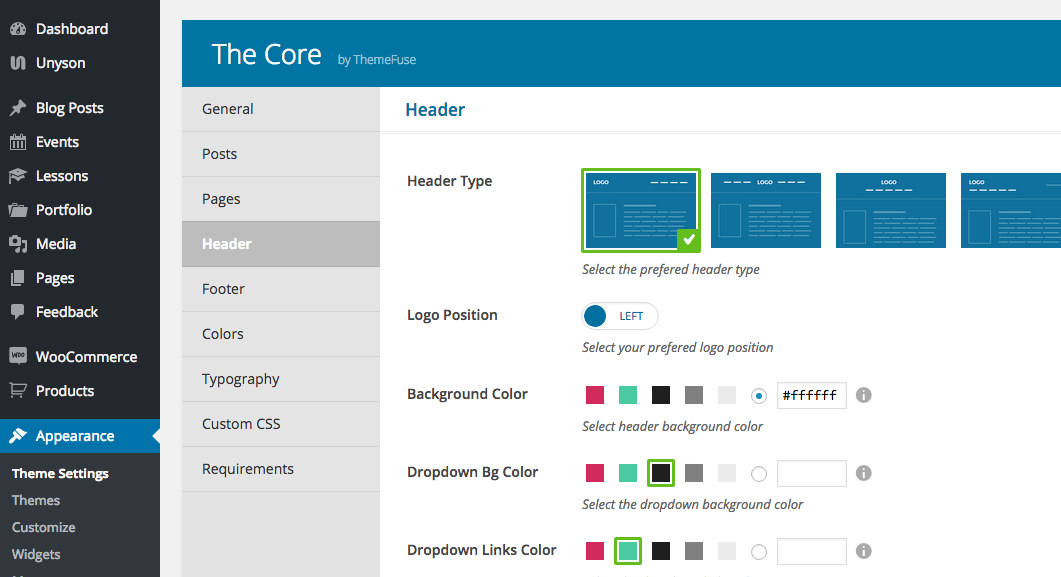
In this theme the header is composed of two parts:
- The Header - contains the logo and main menu of your website.
- The Header Top Bar - used to display the header social icons and an info text usually used for an email address or phone no. It can be turned ON or OFF.
The header options
- Header Type - lets you select from the 6 predefined header types.
Type 1

Type 2

When you first choose the type 2 header, your header will look like this:

You'll need to select a top secondary menu from the Menu Locations in order to make your header display as intended. Learn how to add a menu for this header from this article.
Type 3

Type 4

Type 5

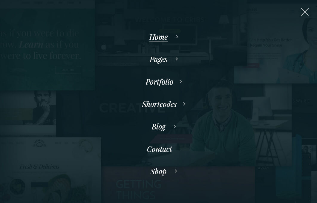
Access the styling options for the overlay menu by pressing the Overlay Menu Styling button.
Type 6
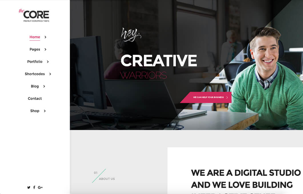
Access the styling options for the tray menu by pressing the Menu Tray Styling button.
- Background Color - lets you change the background color for the header. Choose one of the 5 predefined colors or input a custom one.
- Dropdown Bg Color - controls the dropdown background color.
- Dropdown Links Color - lets you change the links color from the drop-down.
- Boxed Header - lets you make the header boxed and also set a margin-top in pixels. If you also enable the Absolute Header option you can achieve something like this:
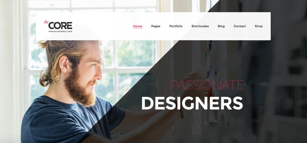
- Absolute Header - enable this option to make your header positioned absolute. This absolute positioning will put the header on top of the header image. This option doesn't work with all the header types.
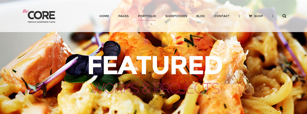
Set a background color for your absolute header even if the opacity is set to 0. The reason you'd want to do this is because on smartphones the absolute header option is disabled and you'll want a background color for your logo (the opacity is set by us to 100%).
- Sticky Header - lets you make your header stick with the scroll. This option doesn't work with all the header types.
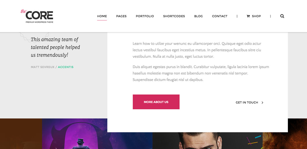
The header top bar options
- Header Top Bar - select YES if you want to enable your Header Top Bar.
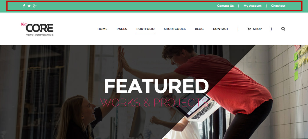
- Background Color - lets you control the background color for the top bar.
- Text - this top bar text is usually used for an email address or phone no (it supports HTML).
- Social Icons - use this option to enable the display of your social icons. Your social links can be set from the Social Profiles tab under the General settings. Learn how to add/edit your social links from this article.
- Social Icons Color - controls the icons color.
- Icon Size - lets you set the social icons size in pixels.
- Socials Position - controls the social icons position on the bar.
The text option will be positioned based on the positions of the social icons. For example, If you choose to have the icons on the left, then the text will be positioned on the right.
The search options
- Search - select YES to enable the search on your website.

- Type - lets you select the type of the search field: Input Search or Icon Search.
- Position - use this option to position your search on the header or on the top bar. Play with the different positions to see what suits your needs better.
You can't control where your search will be displayed on the top bar or header, this will happen automatically based on your choices made on the other options.
